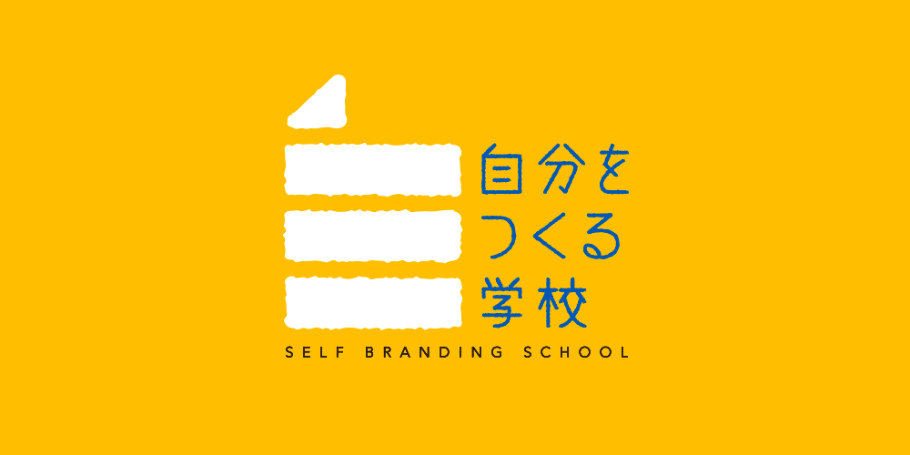
This school provides a venue for students to redefine their individual visions of the future and promote them through effective utilization of social networking sites and other media. In doing so, students learn more about themselves. A logo was designed for the school using the concept of a smartphone icon incorporating the Chinese character for “self,” as found in the Japanese word for “myself.” The character is represented as a door that opens from the inside to the outside world, expressing the school’s approach to learning. Yellow is used to represent the ability to communicate clearly, while blue symbolizes the ability to think and study in depth.
日本初のセルフブランディングをテーマにした学校『自分をつくる学校』のビジュアルアイデンティティを制作。(同学校は、TBS系列『情熱大陸』にも出演し独自のノマドワークスタイルが注目を浴びている安藤美冬氏が学長を勤め、東洋経済ハックシリーズの著者であり龍谷大学経済学部客員教授の原尻淳一氏が講師を勤めています。)この学校は自分の将来像を再定義しそれをSNSなどを駆使して外にどう発信していくかを学ぶ、まさに自分が主題の学びの場です。そのため、自分の「自」の文字を、スマホアプリのアイコン化させるコンセプトでロゴ化しました。この「自」の文字は開いた扉を模しており、それは自らの内面の扉を開き外界へ発信する、学校の教育そのものでもあります。黄色は明瞭な発信力を、青色は深く考察する思考力を表現しています。
CLOSE
